5 Brilliant UI/UX Lessons For This Week
Traveling this week I had the opportunity to read some brilliant UI/UX design tips articles.
Here are my top 5:
You might also find this one useful:
They say the average human attention span is 8 seconds these days.
If this is indeed the case, your design must deliver the message within less than 8 seconds.
Your ingredients are:
- The text
- The icons/photos
- The colors
- The background
In order for your design to tell your story quickly and efficiently - visual hierarchies are a must.
I recently came across a brilliant infographic showing some amazing examples:


Source: digitalsynopsis.com
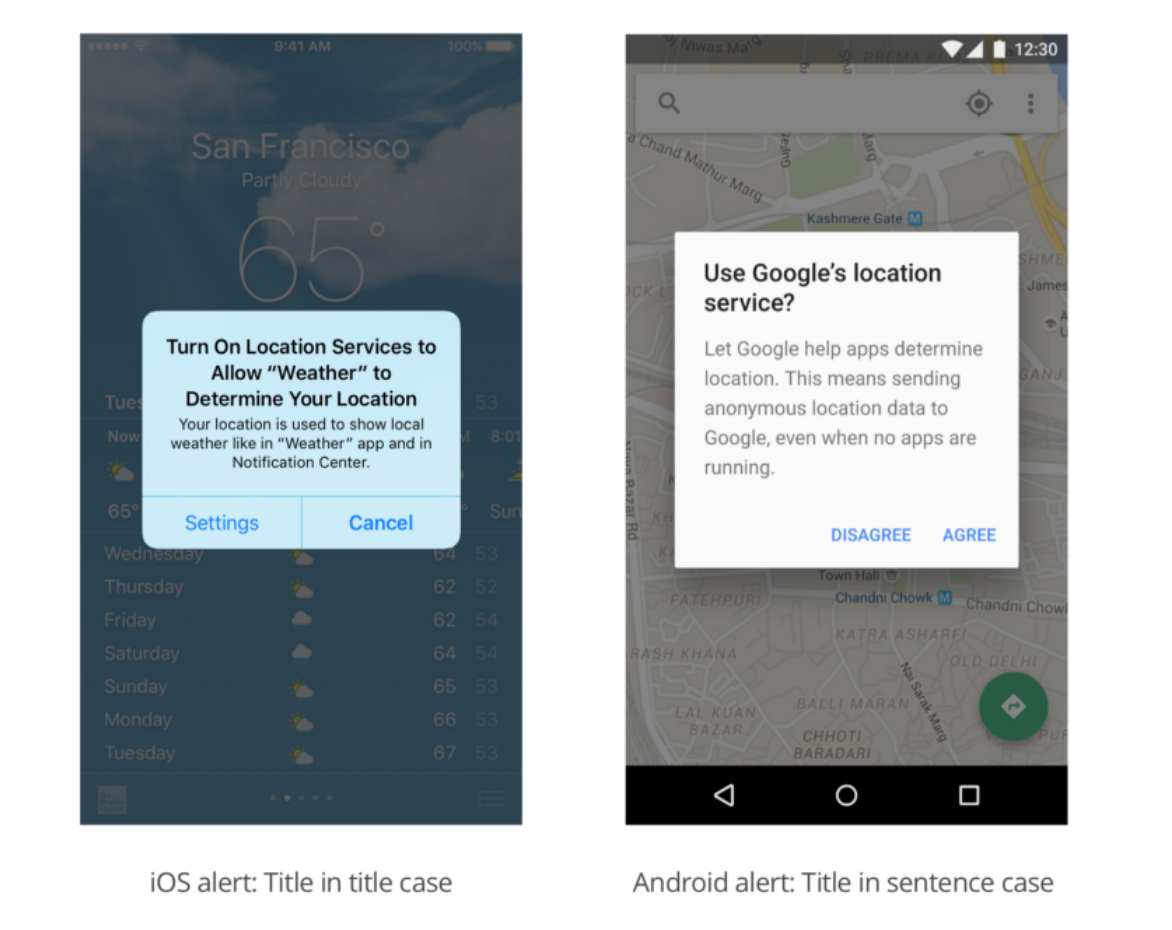
The following guide explains everything you need to know about letter casing and how it impacts the way customers read your text.
Going back to the previous point (8 seconds attention span) - making your text easily readable can change the conversion rate of your product.
White space is like the supporting cast whose duty is to make that the star of the show stands out more by not standing out so much themselves.
This guide showcases some interesting examples and explains all about white spaces.

This one is by far the best tutorial for UI animations.
Explanations about the proper speed, movement, different sizes and how they impact the animation and much more.
There are some basic tips there along with some pro tips - a must read for everyone who works on UI/UX or even presentations.

Most studies have shown that dark text on a light background is superior to light text on a dark background, and yet, many products go with a dark background.
This article explains how to properly design a dark background product.

That’s it for this week’s summary.
Check out my twitter account for more useful design and product management resources.
Comments
Post a Comment