I still miss these 2 gadgets because of their unique design

There are products that stay with you long after you stop using them.
I recently found my old Microsoft Band lying between my socks and my underwear, and it gave me the idea to write about 2 of my all-time favorite gadgets and why I still find them interesting and unique.
It’s because of their design…
Microsoft Band:
The Microsoft Band was released in 2014 and was Microsoft’s first move in the wearable space. It was a fitness tracker with a unique design and a crazy number of sensors (over 10). I used it for a year or so, before switching to the Apple Watch.
The Band had a few design innovations I still appreciate:
1 - The screen was located at the bottom of the device
If you are wearing a watch, try to lift your hand and look at it.Feel that extra effort? You need to lift your elbow in order to enable the rotation of your wrist.
Now, imagine you are wearing a Microsoft Band, where the screen is placed on the inside of your wrist.
Lift your hand and notice how easy it is to rotate your wrist to see the screen. This is what I’m talking about.
To my knowledge there’s no other wearable who adopted this approach, which, after using the Band for over a year, was simply incredible.
2 - Landscape UI running on a landscape screen
The Band carried a pretty small screen, but it was a cool one: it was very wide and was designed for landscape mode only. Everything scrolled horizontally, even the text. Whenever you wanted to read something long, the text would scroll horizontally. Tiles scrolled horizontally as well, and it actually made a lot of sense.
Related: a list of all operating systems running on smartwatches.
3 - Freaking keyboard
Seriously. It had an on-screen keyboard. I didn’t use it frequently but whenever I needed it - it worked pretty well. There are times I wish I had an on-screen keyboard for the Apple Watch, as an alternative to voice dictation.BTW (shameless promotion ahead), on-screen keyboards can drive users crazy when they don’t work well with the UI. Here are 10 tips for handling virtual keyboards without messing your mobile app usability.
Recommended: over 100 UI design tips - the best of the mobile spoon.
4 - Live tiles
I’m a live tiles fan. I liked them from the early days of Windows Phone (RIP) and I still find them extremely useful. To me, live tiles are a nice combination of home screens with app shortcuts, widgets, and notification centers. Their biggest disadvantage is that you cannot have a tile for every app you use.The band held a nice collection of widgets giving quick access to the main apps and a visual snapshot of all the updates that require your attention.
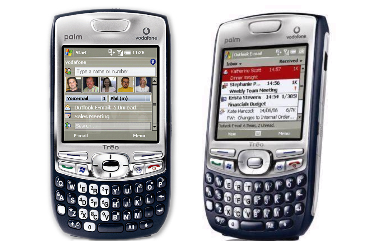
Palm Treo 750
The second gadget I miss is my first true smartphone: the Palm Treo 750. It was released back in 2006 and unlike most of Palm’s devices, it ran an operating system developed by another company: Microsoft’s Windows Mobile.
The Treo had a lot of unique advantages:
1 - Perfect grip
The chubby design of the Treo, along with the rubbery texture of the back cover made it feel like it was part of your hand. I never enjoyed holding a phone like I did with the Treo and it never slipped.When designers talk about delightful moments - this is what they mean.
2 - Single hand navigation despite having a touchscreen
Back in the days, you could either use a touchscreen (with a stylus of course, because there were no capacitive screens before the iPhone…) or skip the touch and use a keyboard with navigation buttons or trackpads (like Blackberry had).The Palm Treo was the first device to properly combine the best of both worlds: it had a touchscreen with a stylus, but you didn’t have to use them because the navigation buttons worked so well with the OS. As a result, you could use the smartphone with a single hand, and fully operate an operating system in a whole new way. It was a big win for Palm in terms of usability.Design wise, blending contradicting approaches is a risky move, but Palm managed to make it work
There were other advantages to the Palm Treo, probably not unique for this device only: the keyboard was pretty awesome (10 years ago most people believed physical keyboard is better than virtual one… technology proved they were wrong) and there were so many shortcut buttons you could operate all your favorite apps without unlocking /swiping / face-recognizing / launching anything. A long press on one of the keys you mapped and you could activate stuff.

Despite being my all-time favorite gadgets, both the Band and the Treo didn’t stick around for long.
The Band was discontinued after 2 years and 2 product versions. The Treo remained popular for a while (with a few successors) but like most smartphones of that time, it didn’t survive the iPhone/Android revolution.
Comments
Post a Comment