Mobile UX design trends to watch out for in 2020

It has been over a year since my post about mobile design trends to watch out for in 2019.
Reading back this post from December 2018, it seems that not much has changed, and many of the trends are still happening: chromeless designs, gestures, gradients, deep flat, big bold fonts, and more, they are still here and will remain dominant during 2020.
Here’s a closer look at some new mobile trends that will continue to grow in 2020:
1. Dark mode
Yep, I know that's old news already, but you know what they say: "once apple decides to go black, no one can go back...". With the release of iOS13, dark mode has become built-in in every mobile app running on Apple devices.
This is, of course, not just an Apple thing, as Android and Windows also support this mode, but Apple has its' way of pushing such initiatives really fast, with devices that are almost immediately up-to-date with the latest OS version and a developers community that is very disciplined and following Apple's guidelines.
This is, of course, not just an Apple thing, as Android and Windows also support this mode, but Apple has its' way of pushing such initiatives really fast, with devices that are almost immediately up-to-date with the latest OS version and a developers community that is very disciplined and following Apple's guidelines.
Personally speaking, I’m not a huge fan of this mode, mainly because most apps are currently using pure black and white colors that are awful bad for the eyes and causing eye strain.
The rule is simple:
Don't use pure black on a pure white background.(Check out my guide: designing text in products)
Most designers know this (just check out most of the websites or apps and you will realize the black is usually a dark gray), but for some reason, too many app developers neglected the opposite rule, which applies for designing dark modes:
Don't use pure black as your dark mode background.
Unfortunately, many apps are using pure black as a background, causing overstimulation.
Looking forward to 2020, I'm pretty sure this will be solved.
I believe we will see app designers gradually optimizing their dark mode designs, adding some creativity to it, but also making it easier on the eyes.
I believe we will see app designers gradually optimizing their dark mode designs, adding some creativity to it, but also making it easier on the eyes.
 |
| Vibrant colors on pure black are overstimulating for the eyes. Use dark gray instead. |
2. Giant phones are the new standard
A year ago giant smartphones were still a “trend”, but now they're the standard:
- In October 2018, only 16.3% of Missbeez mobile on-demand app users were using large iPhone models (X/XS/XR, etc.).
- It’s now December 2019, and this number is 41%, and growing on a monthly basis.
This allows developers to double and triple the content of their apps without creating clutter or compromising on whitespaces.
3. Diversifiable design
Big phones provide larger screens which make it possible to combine multiple view types in one screen without creating a mess: shortcuts, stories, photo carousels, tab-bars, there’s room for a combination of them due to growing screen real-estate.
Here’s a perfect example by Yelp:
 |
| Larger phones make it possible to combine multiple view types in one screen without creating a mess |
4. The branding is gone, but the brand remains
I mentioned this one last year and the trend of hiding brand-related elements such as colors, icons and logos continued in 2019 and will probably continue in 2020.
The last app to go through a major facelift was Spark, which used to be all blueish and built out of frames and borders, and was just recently redesigned to be all white and clean, just like most of the leading apps.
 |
| No more brand colors and images - it's all about content. |
So companies continue to get rid of unneeded colors and visuals, to free up space for more content, but more importantly - make it easier for the users to concentrate, and focus on what’s really important.
Before you continue - check out the following:
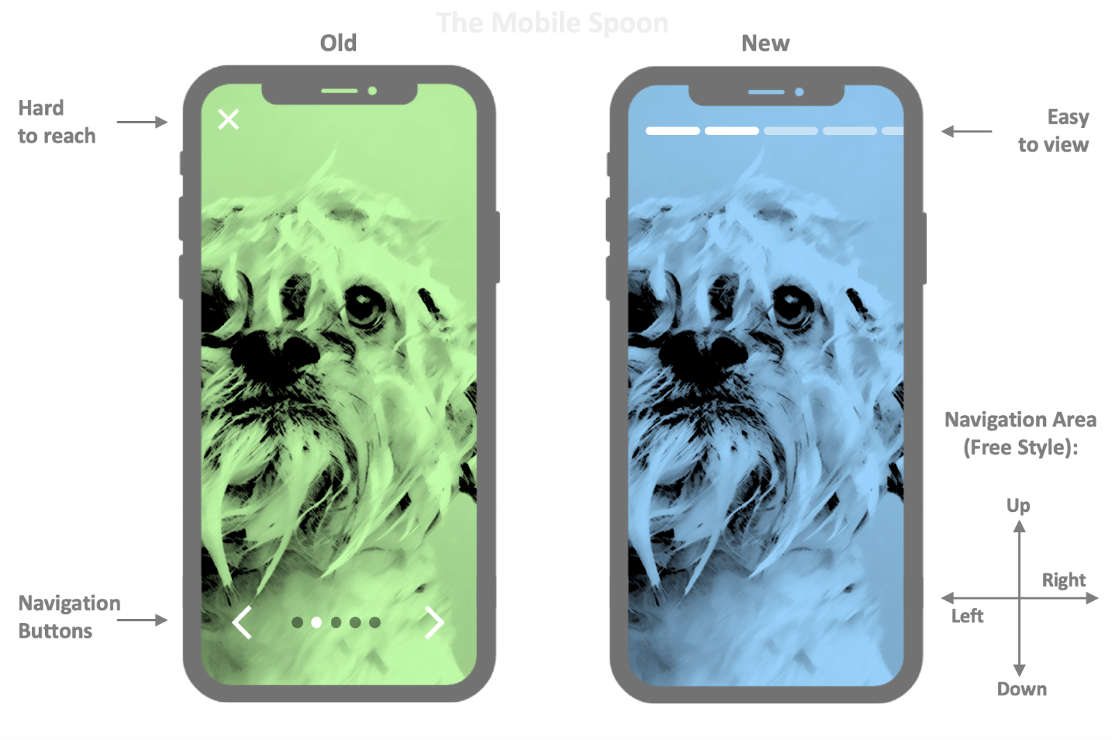
5. Navigation controls go all the way to the bottom:
As devices are getting bigger, it's becoming impossible to reach the upper areas of smartphones.UI elements that were historically placed at the top of the screen, are no longer accessible, which leads to some new navigation alternatives.
Here are a few examples of navigation elements that are located at the bottom:
- Pocket's hamburger menu is now located at the bottom left corner
- Feedly’s side menu comes up from the tabs bar
- Superhuman’s action sheet come up from the bottom area of the screen
- Uber’s swipe-up cards are activated with a swipe gesture

Still not impressed? Check out some more examples below:
- IMDb now places the search bar at the bottom of the screen.
- Microsoft To-Do has a rich entry taskbar, which is located on top of the keyboard and allows adding task details without stretching any finger.
- Clash Royale’s new info cards are designed bottom-up. Check out my beloved Bandit and Witch.
 |
| Where did that search bar go? |
6. Stories are becoming a design pattern
Stories have become so popular in social media, it was only a matter of time until we see other apps borrowing story-style UI concepts and implementing them in new creative ways.Here are 2 examples I really like, by zest and Shazam;

The Zest app uses a paging indication placed on top, to improve clarity and orientation of the users while they contribute content (a few steps process).
With Shazam, you can now view a collection of short clips by your favorite artists.
This UI allows you to quickly jump between short video snippets by tapping on the left or right areas of the screen. No accuracy required while you concentrate on the songs.
This is a good example of a great mobile experience: the design makes good usage of the screen, the navigation indication is placed on top (out of reach, but very clear as it should be), and the navigation is done by tapping the sides of the screen and doesn’t require any accuracy at all, not to mention the option to swipe left/right, up/down for more options.
It’s perfect.
Here’s a more generic example of this approach:
7. Is that skeuomorphism in your pocket or are you just happy to see me?
It used to be a big one until 2012/2013, but when the world got flat we lost any signs of depth or shadows.Last year I wrote about the comeback of the gradients and shadows - also known as Flat UI 2.0, or: Deep Flat.
In 2020 we will see some more of this trend: more shadows, more 3D, more depth and even a bit of... (drums...) ... skeuomorphism. 😳
Don’t believe me?
Check out these examples taken from iOS 13:

That’s it for this round, 2020 is here and mobile will continue to lead the design world with more innovation, amazing usability, and great experience.
Before you leave, check out the following roundups summarizing some of the best posts by the mobile spoon:
- How to design great products - the best of the mobile spoon
- How to become a better product manager - the best of the mobile spoon
- 10 successful product leaders share their tips for creating successful products in 2020
Don't forget to subscribe to the newsletter and become 23% more awesome than average!
Comments
Post a Comment