The host syndrome: what is it and how to avoid it in your product
I call this phenomenon "the host syndrome”.
The host syndrome happens when the host tries too hard to impress the guests and make them aware of the efforts made to arrange the party and appreciate things nobody cares about, usually resulting in the exact opposite.
Like many cognitive biases, the host syndrome creates a blind spot that turns the host into an annoying creature.
This phenomenon can be found in software products too. For example, product creators (AKA the hosts) often push their product features too aggressively, causing their guests (AKA the users) to feel uncomfortable and lose interest.
Let me walk you through the hosts' metaverse (wanted to use the term "metaverse" and that's what I came up with) and how to cure those symptoms:
1. A loyalty program at your face
Imagine this: you search for some content online, run into a website, and before you get a chance to read anything - boom: a “subscribe to our newsletter!” popup is covering 70% of your screen.
- “Sure!” You’re thinking… “why not donate my email to this random website?”
In the physical world, this madness is like getting into a new restaurant, and instead of getting a menu, the waiter asks you to join a loyalty program.
The hosts (in this case the website owners) are confident that their content is so good that people will immediately realize it and subscribe, but that’s not usually the case.
Value first, commitments later
As I wrote in my product-led growth pocket guide - any kind of commitment required from the users (whether it’s a payment, a tedious sign-up form, and even a newsletter subscription) should come AFTER they witnessed the value of the product.
That's why you need to restrain your appetite, monitor the behavior of your users, and wait for the right timing to make your move.
2. A colossal amount of pop-ups
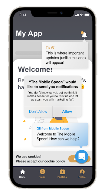
Ever opened a mobile app and the first thing you got was a series of permission requests (notifications, location, etc.) piled on top of each other?
Who’s the goof that designed it, right?
Welcome screens, notification privileges, location privileges, product tips… there are just so many bureaucratic tasks to handle when a new user comes in!
It’s like walking into a hotel and having the manager, the concierge, the chef, the masseuse, and the lifeguard all jumping at you, asking you to check-in, make dinner reservations, sign your health statement, and collect your towels - simultaneously.
This inelegant experience doesn't exist in the physical world, but it exists in bad products.
It happens when products fail to plan a gradual and subtle onboarding process, and instead, just throw everything they've got at their poor users.
Base your requests on user intent
Postpone permission requests to the right moment, when the user has the intent of doing something that requires those permissions (for example, allowing push notifications in order to get a reminder for something that was just created in the app).
3. Exhausting interrogations
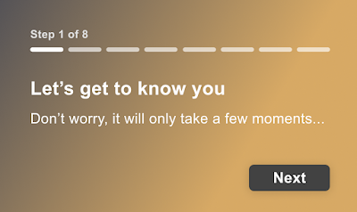
With this type of host syndrome, the poor users have to go through a long tedious questionnaire before they can use the product.
It’s like having a Foot Locker sales associate standing outside of the store, asking about your shoe size, exercise habits, favorite colors, Michael or LeBron, instead of just letting you in.
When you imagine the physical equivalent of such experience it feels ridiculous, and yet, many digital products are doing exactly that.
To minimize drop-outs, ask for what’s really important
So whenever you’re about to throw another step at your new users, ask yourself the following:
- Is it really necessary to have this step completed during onboarding?
- Are you risking losing users by adding this step?
- Could it overlap with another step that's already part of the existing onboarding process?
- Is that the kind of behavior your guests would appreciate if you hosted a party or opened a restaurant?
4. Dumb walkthroughs
A dumb walkthrough happens when a company decides to improve user onboarding by implementing a tool such as Intercom or WalkMe, or any of their alternatives, and completely misuse (or overuse) it to turn the lives of the users into a living hell.
At its’ worst, a product tour shadows the entire screen and forces the users to try out features they don’t care about, one button at a time, without being able to opt-out and put an end to their misery.
Why do I think it’s dumb, you ask?
Well, to begin with, it’s an invasive technique that cuts users off, just when their interest has peaked. In addition, it slows them down just as they’re getting started, wastes their energy, and provides too much information, often out of context, without creating real engagement.
Bite-sized tips instead of lengthy walkthroughs
If you insist on helping your users to get familiar with your product - I would consider the following best practices:
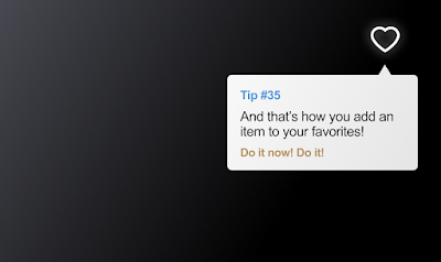
- Replace lengthy walkthroughs with bite-sized tips
- Don’t overwhelm your users with too many tips at once
- Instead, only show tips that are relevant to the context they’re in
- Never block your users when showing a tip and always provide an easy way out
- Always think about progressive disclosure - and let your users discover the greatness of your product gradually
- Use product tours to introduce new capabilities to existing users, but leave your first-timers out of it
5. Asking “Was it good for you?” too soon
Ever got the “enjoying our app?” message right after signing up? It’s funny when it happens but it happened to me more than once.
Nudging users to provide positive reviews is a legit move, but just like with real-life relationships, asking too soon feels like a desperate move (“I just got here, don’t they have real users to ask?”), and desperate moves turn users off.
Here, just like with newsletter subscriptions, you must wait for the right timing:
- Never ask for a rating on the first launch or during onboarding
- Wait for the aha moment to happen, then ask for a review
- Make sure you are not interrupting the user in the middle of something
- If the user refuses, wait a significant amount of time before asking again
Learn more about aha moments and the difference between soft-activated and hard-activated users.
Take it easy
You worked hard to build the product, and it's only natural that you want everyone to know how great it is and how many things it can do.
But guess what, you are not the story. Your users are, and they are just like those party guests; they don't care about the decorations or the special desserts that you ordered. They just want to grab a beer, hang out with their friends, and have a good time.
And once they get what THEY came for, they’ll be happy and stick around.
Had fun reading? Do me a big favor (so I don't need to block you with my newsletter popup) and subscribe to my occasional newsletter. Rumor says it makes you 23% more awesome than average.


Comments
Post a Comment