Forms completion rates - statistics, insights, and takeaways
Designing forms has always been a challenge. No matter if we're working on a simple onboarding form, lead scoring or a KYC form, UX is always a concern: how many fields should we have? what completion rate should we expect? Do we really need a phone number or can we get away without it?
So as a service to my future self, here are some useful insights and statistics about form completion rates, taken from different studies.
What is a good form completion rate?
The average landing page has a conversion rate of 2.35%, with top websites converting roughly 11.5% of visitors.
A report from WishPond, involving 146 landing pages found some different numbers:
- 64 B2B landing pages showed an average of 13.28% conversion rate
- 80 B2C landing pages showed an average of 9.87% conversion rate
Abandonment rate varies between industries:
- Travel: 81% abandonment rate
- Nonprofit: 77.9% abandonment rate
- Finance: 75.7% abandonment rate
- Retail: 75.8% abandonment rate
People abandon online forms due to:
- Security concerns: 29%
- Form length: 27%
- Advertisements or upselling 11%
- Unnecessary questions 10%
Takeaway: add trust symbols by embedding a lock icon next to sensitive information.
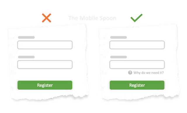
Takeaway: add "why do we ask for your...?" next to a sensitive question.
 |
| Be transparent and explain why you ask for sensitive information |
Keep it simple: 67% of site visitors will abandon your form forever if they encounter any complications; only 20% will follow up with the company in some way.
30% of people will return to complete a form if there’s something in it for them such as a free tool. (source)
How many form fields are too many?
The average B2B lead form length in 2019 was 5 fields, which usually results in the highest conversion rates. (source: Hubspot)
The average B2C contact form has 3 fields resulting in the best conversion rate:
- 3 fields per form ==> 25% conversion rate
- 4 fields per form ==> 20% conversion rate
- 5 fields per form ==> 15% conversion rate
With consumer forms - removing a single field can boost the form completion rate by 25%.
How to design a form for maximum conversion?
 |
| Multi-step forms can improve completion rates |
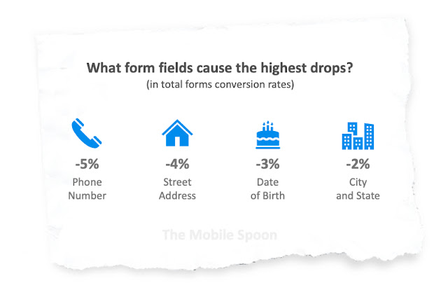
What form fields cause the highest drop rates?
- Phone number: -5% in total conversion rate
- Street address: -4% in total conversion rate
- Date of birth: -3% in total conversion rate
- City & State: -2% in total conversion rate
The CAPTCHA impact:
- Simple CAPTCHAs Have an 8% Failure Rate.
- Case-sensitive CAPTCHAs have a whopping 29% failure rate
How do form buttons impact conversion rates?
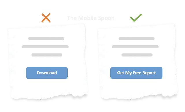
- Don't use vague, generic words such as submit, enter, access, complete, learn, and read more.
- Use strong action-oriented words like get, try, book, download, and register.
Measure every field in your form
You can't predict what's about to go wrong, but you can definitely expect some things to go wrong.


Comments
Post a Comment